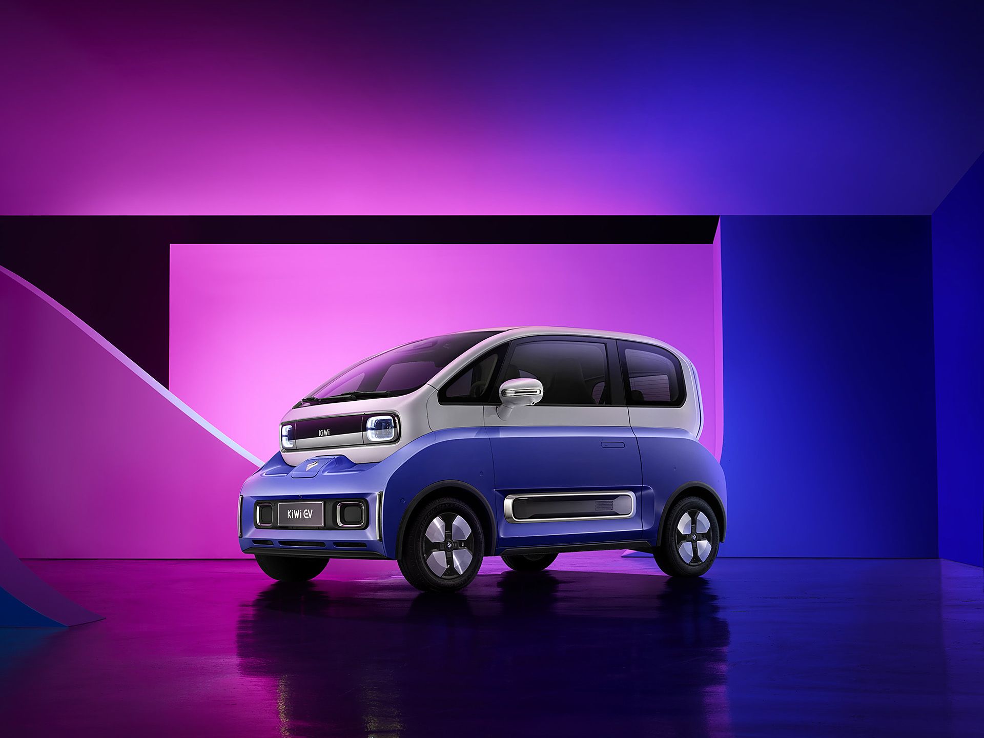
Kiwi EV: Full redesign of LingOS 2.0
01 Background: A Broken Foundation
The 2023 Kiwi EV promised Gen-Z a "fun, trendy" urban driving experience. However, customer satisfaction surveys showed users were deeply frustrated with the Kiwi EV's in-car system, LingOS1.0, and it was hurting sales. But SAIC-GM couldn't pinpoint why or how to fix it.
So they asked us to redesign the entire OS in 4 months without changing the fixed 10.25-inch hardware. Typically, this scope requires 12+ months.
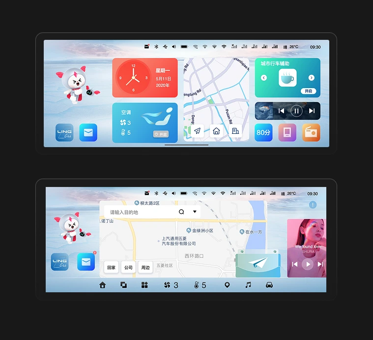
LingOS 1.0
The Core Conflict
How to deliver a safe and delightful interaction system for drivers & co-drivers within extreme time and physical constraints?
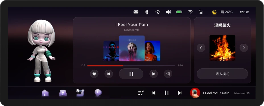
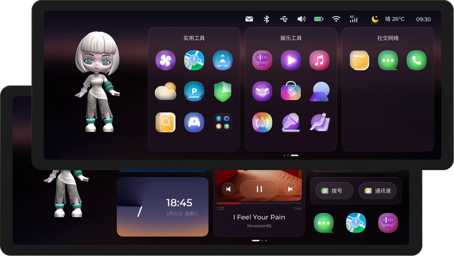
LingOS 2.0
02 The Strategic Bet: Building Order First
When I inherited this project, the biggest obstacle wasn't the design itself—it was organizational chaos.
The Real Constraint:
- No complete PRD
- No system-level prototype
- Scattered UI assets with untraceable decision history
In other words: the organization had lost a "shared understanding" of the OS.
Reconstructing the Truth
(Reverse Engineering)
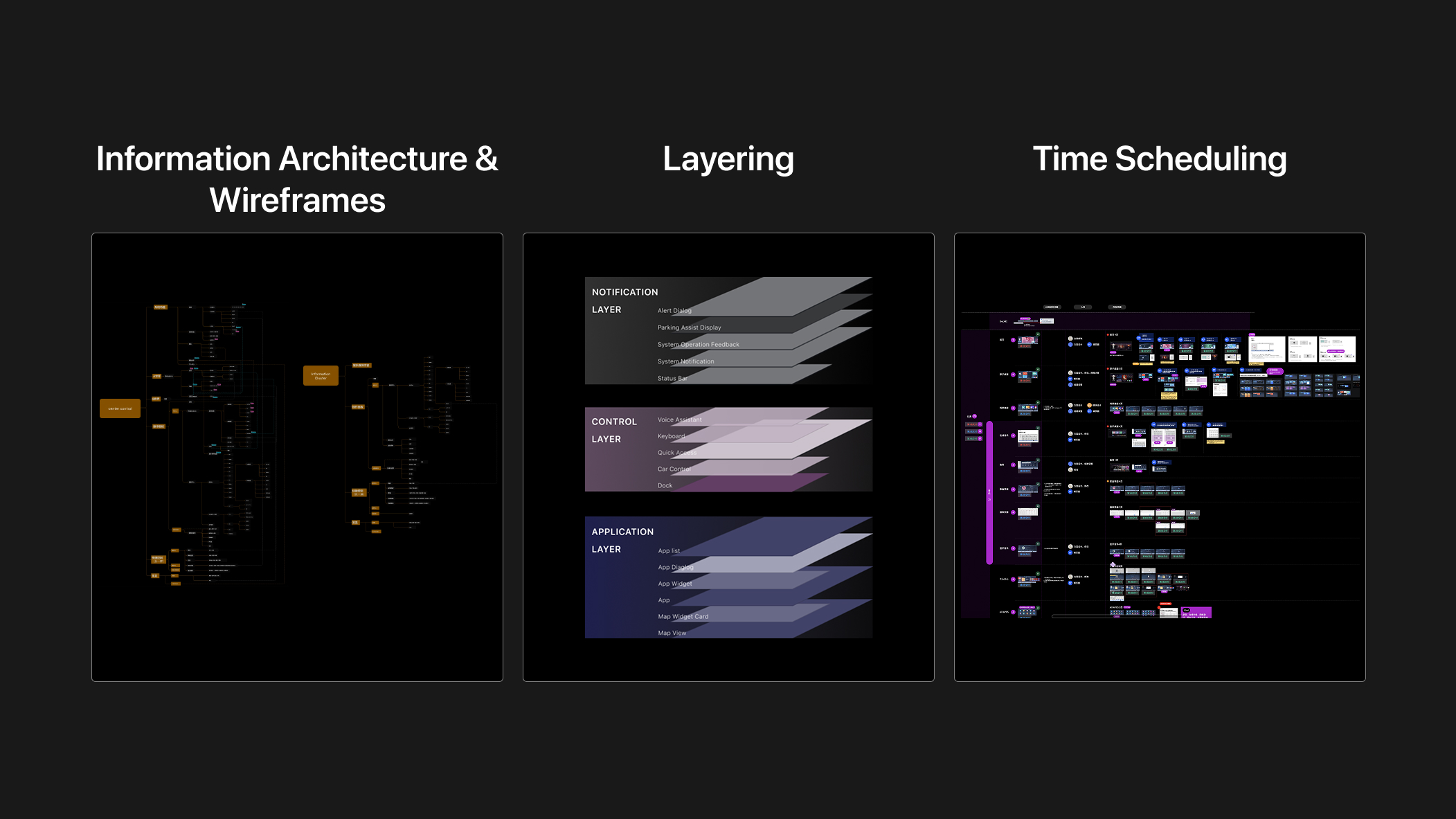
To untangle the technical debt, I led the team in reverse-engineering the entire OS architecture (IA) and wireframes from fragmented UI assets.
Result:
- Exposed functional redundancies clearly
- Became the single "source of truth" for alignment with PM and engineering
- Served as the foundation for OS 2.0
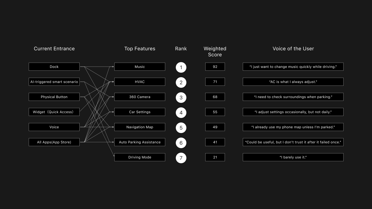
Navigating the Stakeholder Maze
(Governance Framework)
Marketing, Product, and Engineering had highly conflicting and scattered requirements. 1.0's failure stemmed from "wanting everything."
To end endless debates, I established a decision governance framework:
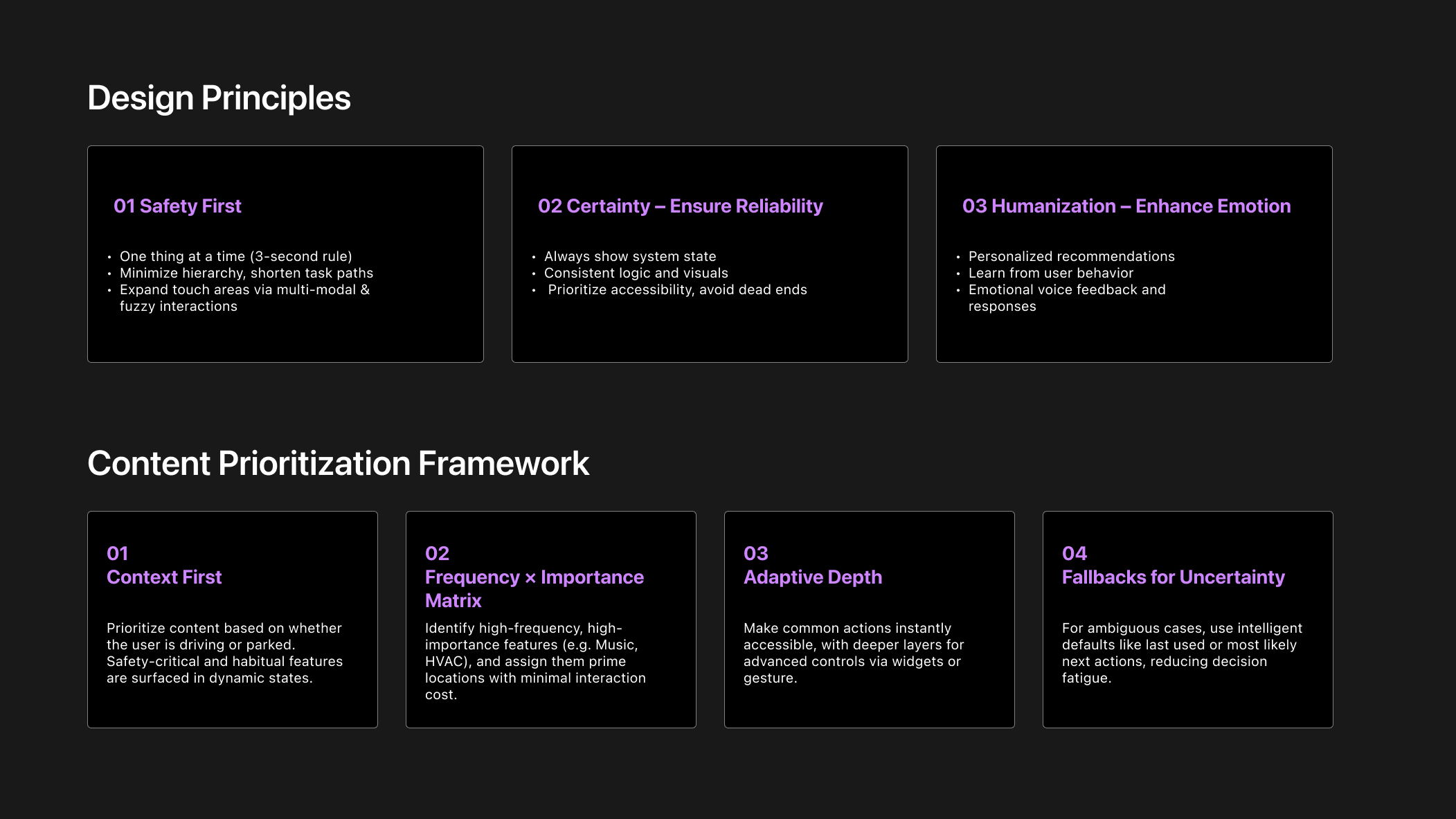
03 Design Strategy: Pruning for Performance
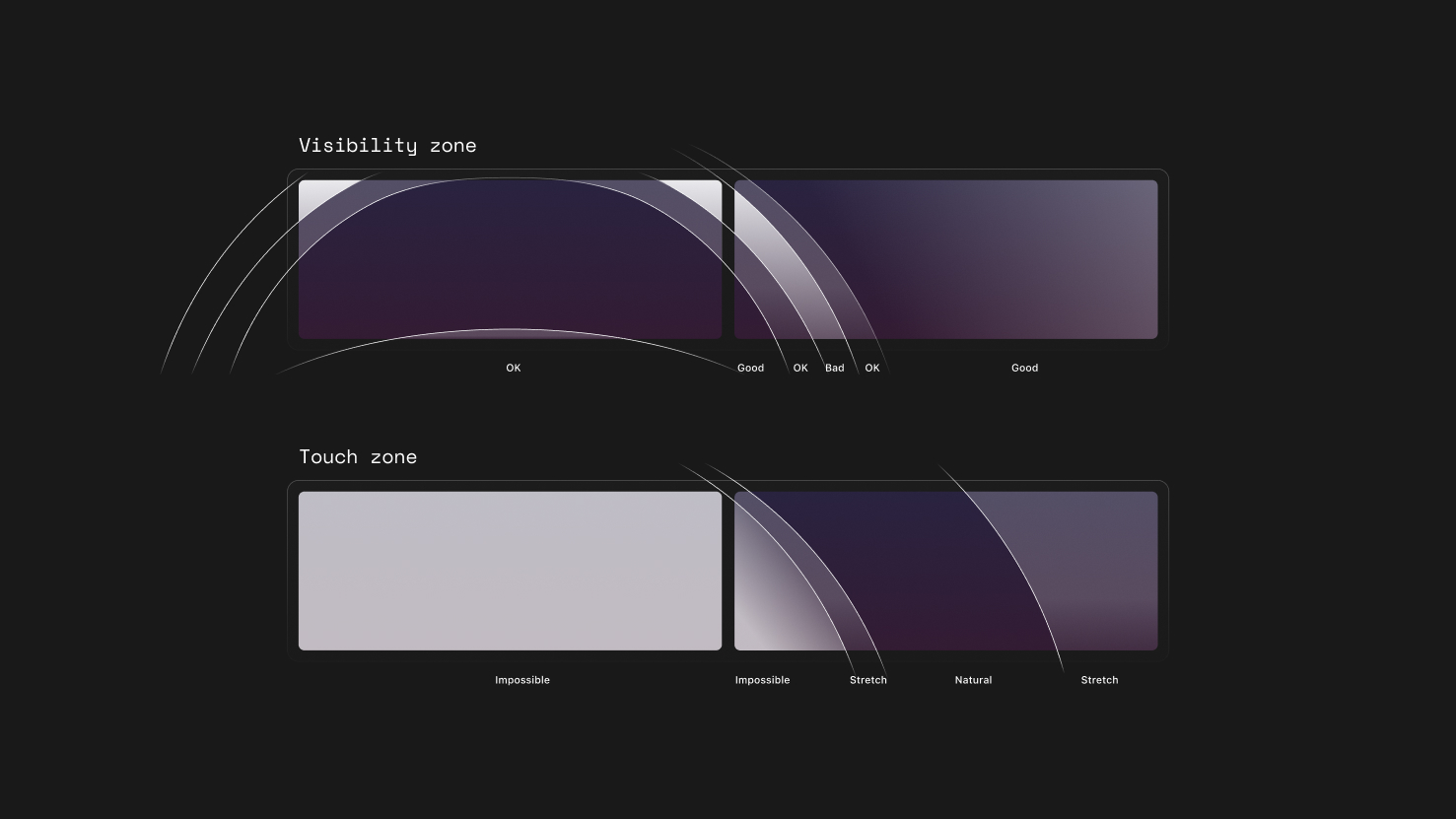
An HMI audit revealed that OS 1.0 failed largely due to a lack of consideration for the driving context. Critical actions were positioned in visual blind zones, while digital features duplicated existing physical controls.
I addressed this by applying a pruning strategy: removing redundancies and refocusing the system around core functions.
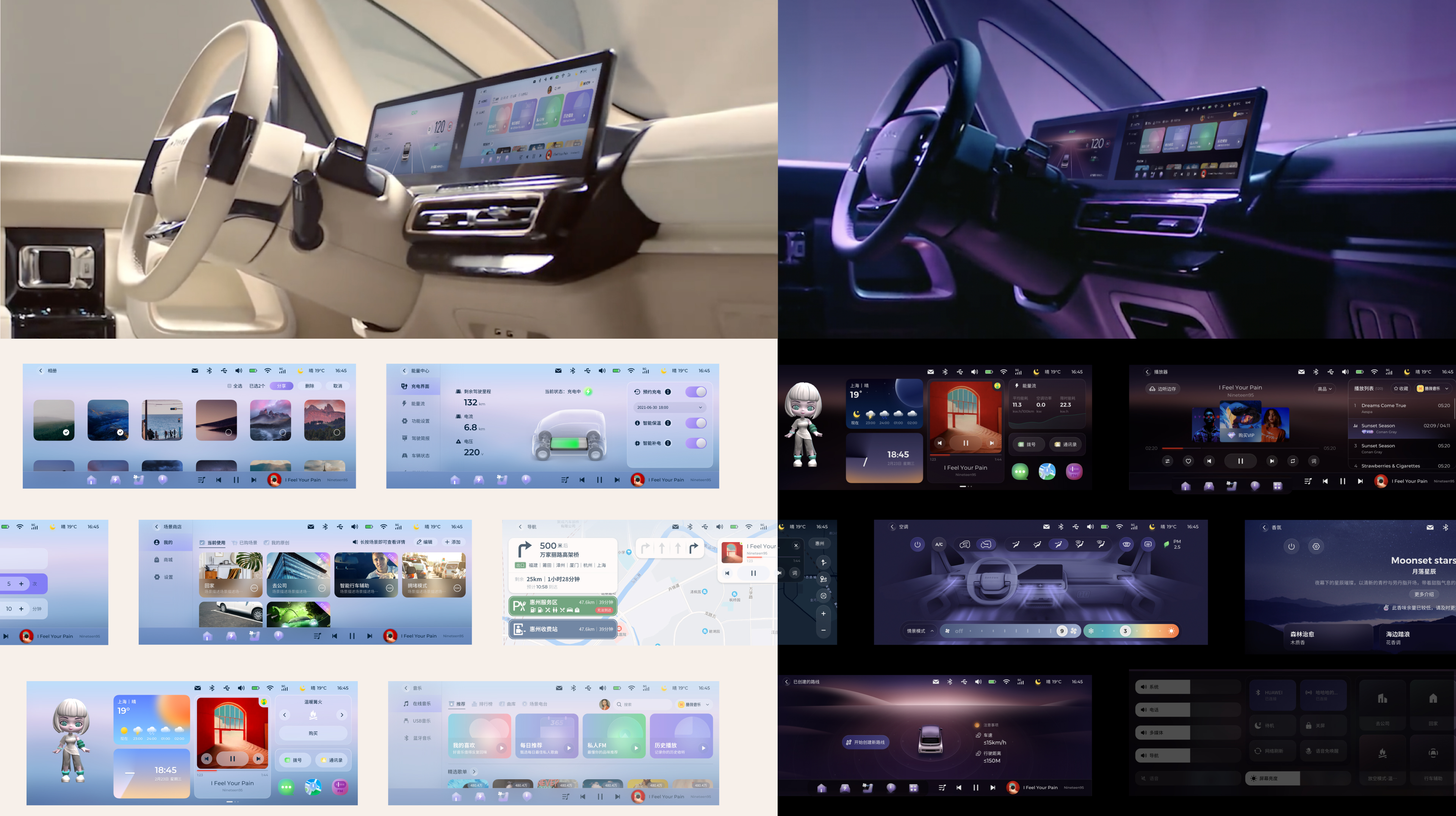
Solution 1
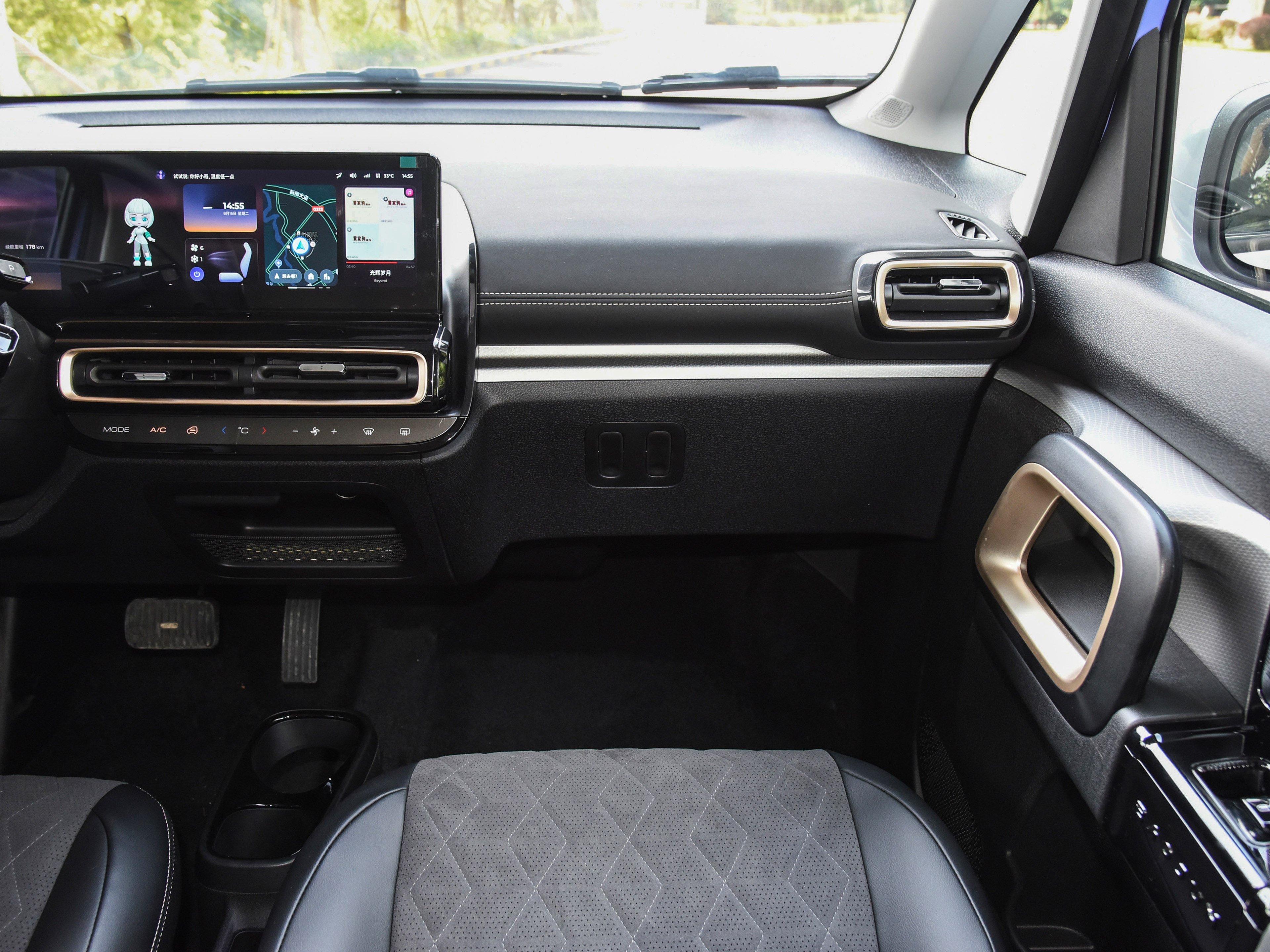
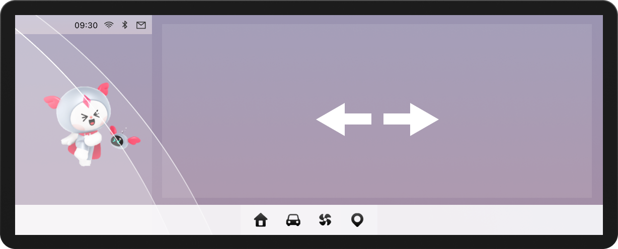
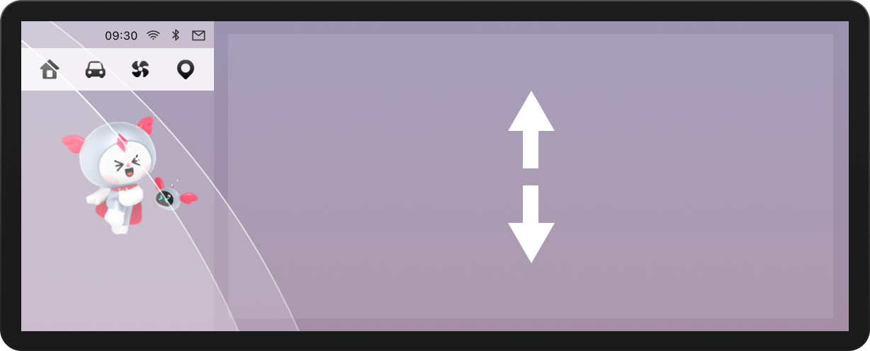
The Dock: Ergo-Centered Reform
In-Vehicle Ergonomic Testing
Evidence:
- In driving task tests, icon scan time increased linearly with icon count
- Error tap rate spiked significantly beyond 4 icons
- Left-side Dock area suffered from steering wheel occlusion (15% of screen area)
- Software functions duplicated physical buttons (e.g., climate control)
Insight:In the driving context, the Dock isn't a "feature hub"—it's a safety-critical control zone. Extra icons only increase visual search cost.
The Decision:
- Reduced icons from 8 → 4
- Position change
- I proposed two solutions:
- Center alignment: Visual balance, but left icons still risk 15% occlusion
- Right-shift alignment: Completely avoids occlusion, but sacrifices visual symmetry
Proposal A: Center alignment
Proposal B: Radical move
Impact:
- Shorter visual dwell time
- Larger tap target zones
- Dock transformed from "feature collection" to "safety component"
Solution 2
Music: Winning Back Vertical Space
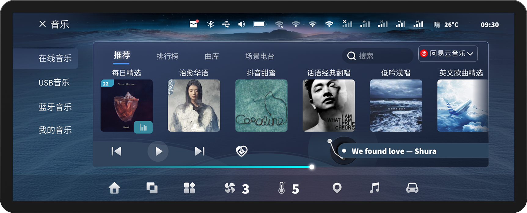
LingOS 1.0 Music
VOC+ Hierarchical Card Sorting
Evidence:
- Music tasks had the longest visual dwell time
- Root cause: Vertical space compressed by Dock + Mini Player layers, resulting in extremely low information density
- Users rated horizontal scrolling as "inefficient and unsafe"
- The biggest complain from co-driver is: can’ switch the songs.(VOC)
The Decision: Integrate Mini Player into the global Dock and eliminate card-style content presentation.
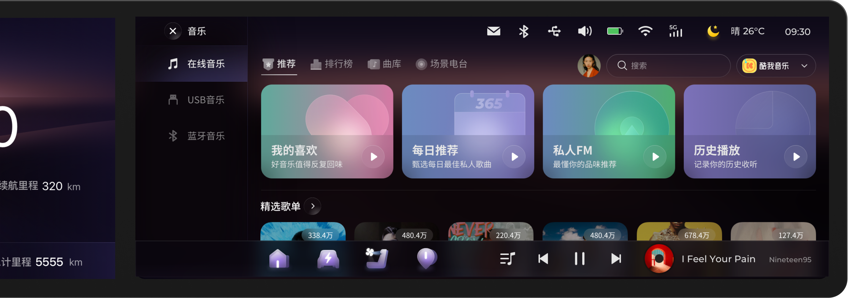
New layout: Mini Player in Dock + Vertical List
04 Balancing Innovation & Business: The Dual Desktop
The KIWI's dual desktop concept – a widget desktop and a Card desktop – was a non-negotiable product requirement. Instead of challenging the constraint itself, we focused on resolving the added interaction complexity through innovative interaction design.
LingOS 1.0 Dual Desktop
Evidence:
- Users couldn't clearly distinguish functional boundaries between desktops
- Accidental desktop switches occurred frequently
Insight: The problem isn't "whether dual desktops should exist," but whether they have clear mental roles.
The Decision: Redefining Desktop Mindsets
Card Desktop - Emotional scenarios
- Introduced "Scenario Store" with cards like Camping, KTV
- Reserved interface for future service expansion
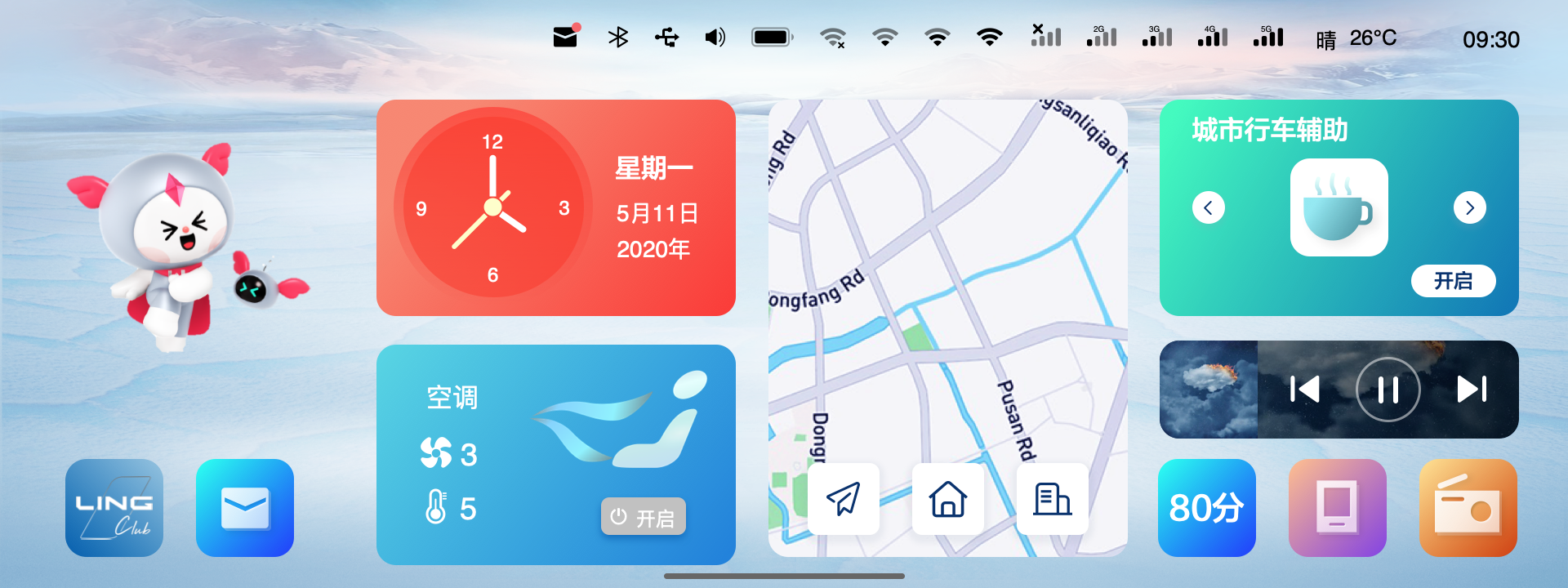
Widget Desktop - Maximum efficiency
- Merged all apps for daily high-frequency needs
- Optimized for quick access during driving
The Switching Solution:
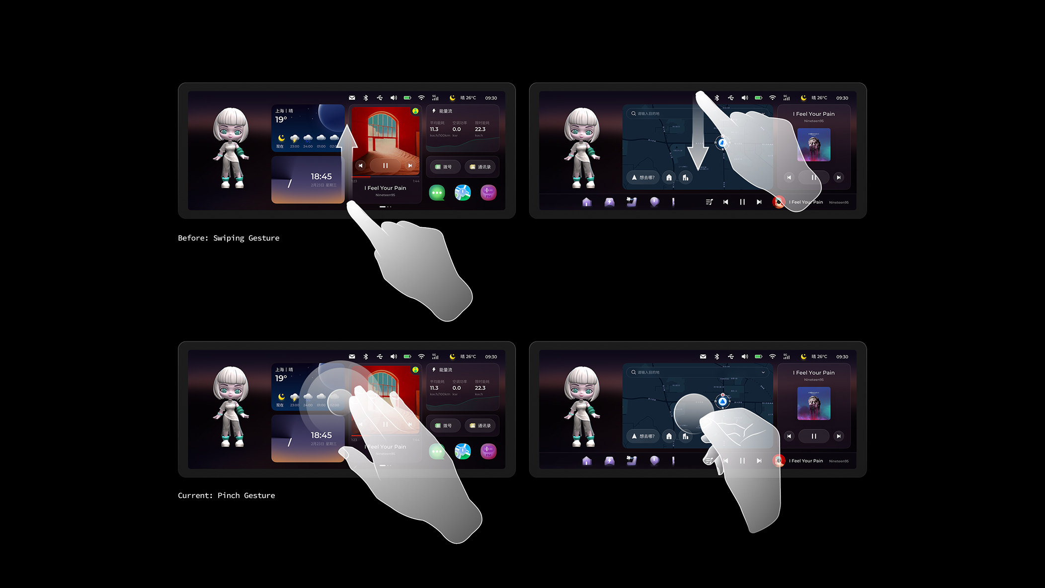
Initial proposal: 4-finger pinch gesture Final implementation after safety review:
Three switching methods:
- Screen edge swipe (left/right) — For parked scenarios
- Voice command: "Switch to scenario mode" — For driving scenarios
- Auto-switch logic: System suggests desktop type based on vehicle speed (architecture prepared for future implementation)
Why we changed from 4-finger pinch: During Physical Buck testing, we discovered that 4-finger gestures require both hands off the steering wheel, violating our "Blind-reachable Control" principle. The final solution prioritizes voice control during driving, reserving gestural switching for parked scenarios.
Impact:
- Eliminated accidental switches
- Reserved scalable interface for future services
- Maintained marketing differentiation while ensuring safety
05 Visual Philosophy: The "Glance"
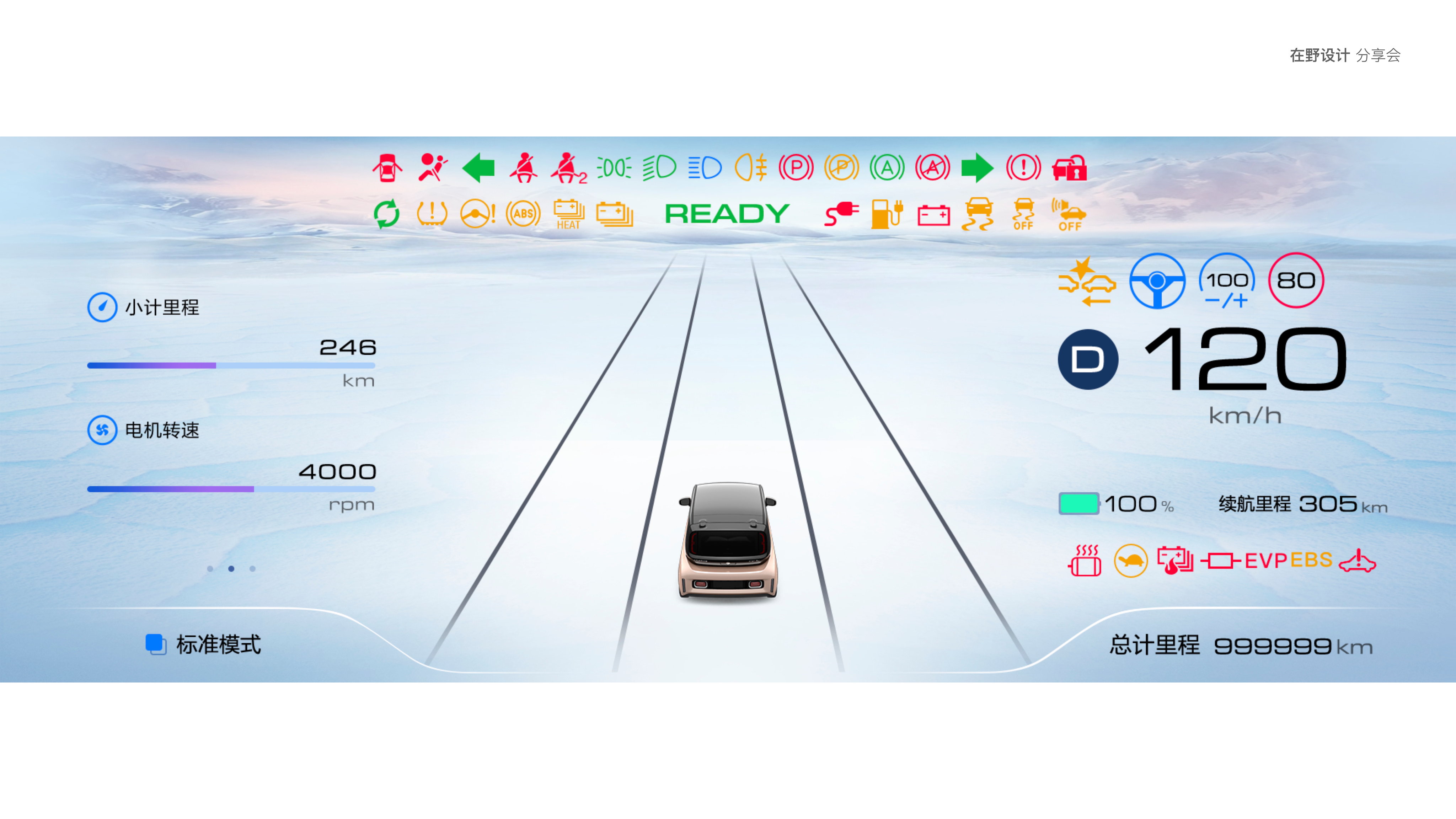
Introducing a Light Theme wasn't purely aesthetic. In the complex lighting conditions of a vehicle cabin, a high-contrast light theme paired with minimal UI significantly improved glance-readability, ensuring users can instantly capture information at high speeds.

Inspired by LIGHT, we designed Icons, Voice AI Assistant, Time Card by time changing.
Intelligent Driving Mode Illustration. Partial designed by UI designers
Accessibility Testing with Multiple Color Palettes and UI Variations.
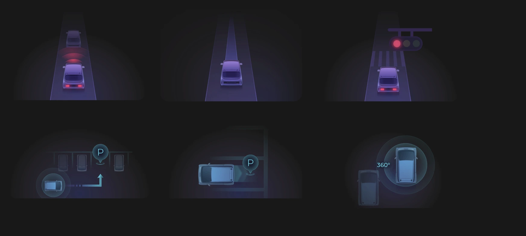
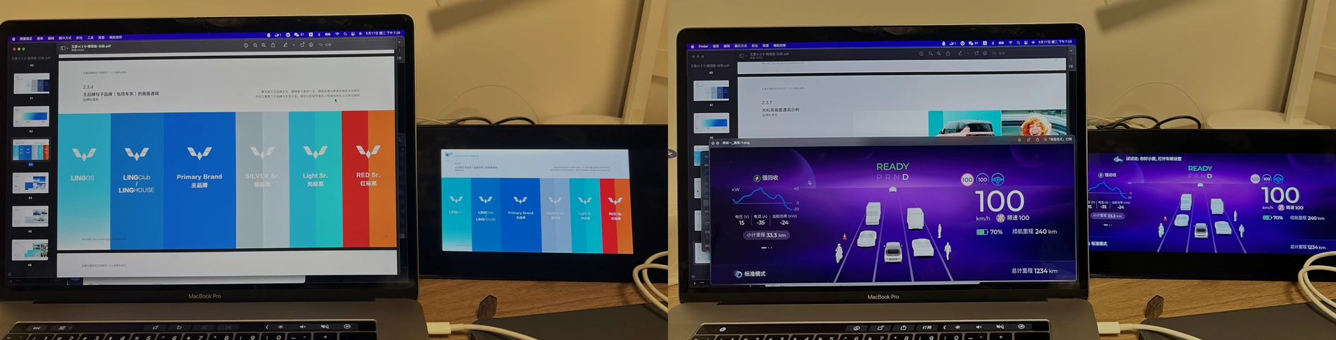
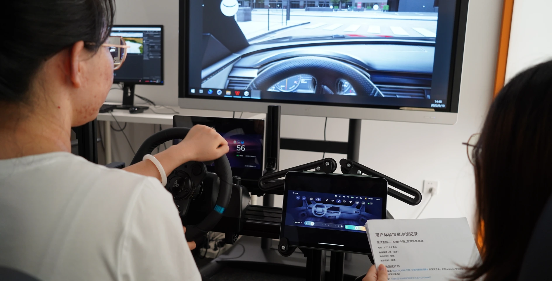
06 Validation: Physical Buck Testing
Due to the 4-month development cycle not allowing multiple iterations on production vehicles, we partnered with Unity to build the Physical Buck (cabin simulator) for high-frequency prototype validation, differentiating parked vs. driving contexts.
Testing Protocol:
- 30 participants (mix of internal staff and target users)
- Scenarios: Highway driving, urban traffic, nighttime conditions
- Metrics: Task completion time, glance time, user satisfaction score
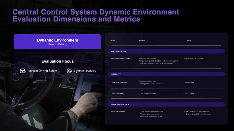
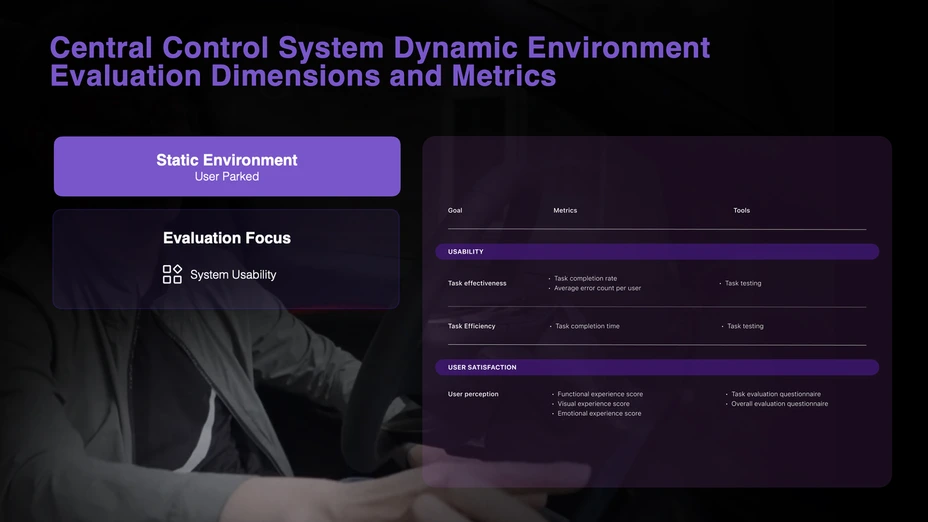
HMI UX Measurement Framework
Buck Testing
Key Discoveries & Iterations:
Issue 1: Initial Dock icon spacing insufficient, 18% mistap rate → Fix: Adjusted to minimum 48px touch zones, mistap rate dropped to 3%
Issue 2: Light theme caused severe glare at night → Fix: Introduced adaptive brightness system, automatically reducing white ratio at night
Issue 3: Music list scroll speed too fast, users couldn't stop precisely → Fix: Added inertial damping algorithm, scroll experience satisfaction improved 40%
Final result: Completed 3 high-frequency iteration rounds within 4 weeks.
56%
Reduction in average total glance time per task
32%
Reduction in average task completion time
37%
Increase of user satisfaction score
07 Scaling
- Design System Deliverables:
- 2,000+ pages of components, guidelines, and documentation
- Comprehensive button & icon library
- Color system with day/night mode support
- Supported by multiple UI designer contractors

08 Impact:
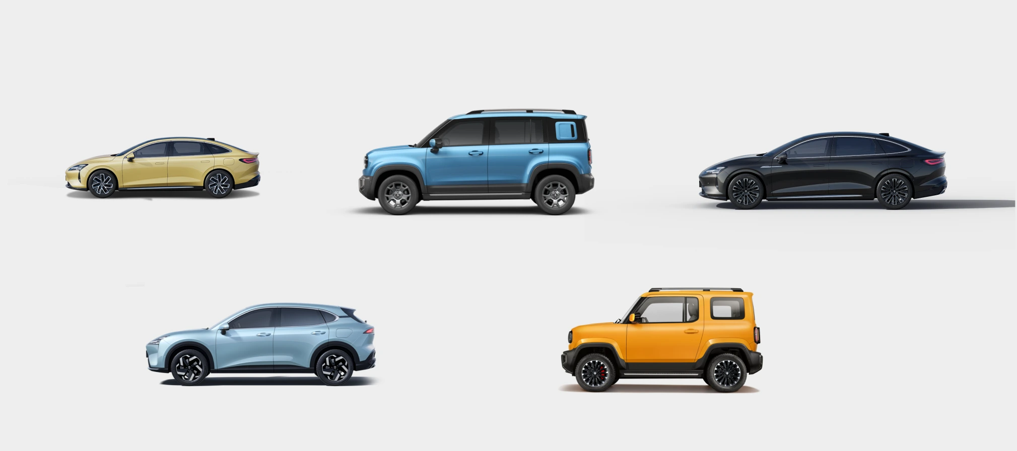
Post-Lauch Adoption
Business Impact:
- Scaled across 8 SAIC-GM vehicle models (Baojun, Wuling brands, 2023-2025)
- 3-year lifespan as SAIC-GM's OS standard
- Design system adopted by 3 subsequent vehicle programs, saving 6 months of development time per program
Reflection
What I learned:
As a senior designer, my value wasn't just delivering a UI—it was establishing a rational decision-making logic within organizational chaos, making design the core driver of product delivery.
The broader lesson: Systematic knowledge accumulation accelerates product design speed and efficiency. The UX measurement framework we built wasn't just used in this project—it became an adaptive tool for the entire organization. Due to time constraints, we didn't conduct the complete measurement suite, but extracted core function tests that proved the framework's flexibility.
Kiwi EV: Full redesign of LingOS 2.0
IMPACT
-56% glance time+37% user satisfaction+32% task completion8 models adopted500K+ units shipped
ROLE
Directed UX/UI team
End-to-end Visual & Interaction Design
Led research strategy
Built design system
Aligned 7 stakeholder groups
CLIENT
SAIC-GM-Wuling Automobile
DURATION
4-month
01 Background: A Broken Foundation
The 2023 Kiwi EV promised Gen-Z a "fun, trendy" urban driving experience. However, customer satisfaction surveys showed users were deeply frustrated with the Kiwi EV's in-car system, LingOS1.0, and it was hurting sales. But SAIC-GM couldn't pinpoint why or how to fix it.
So they asked us to redesign the entire OS in 4 months without changing the fixed 10.25-inch hardware. Typically, this scope requires 12+ months.
LingOS 1.0
The Core Conflict
How to deliver a safe and delightful interaction system for drivers & co-drivers within extreme time and physical constraints?
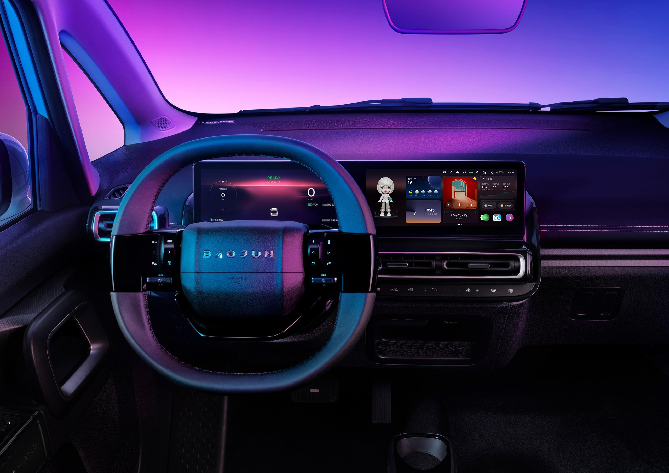
LingOS 2.0
02 The Strategic Bet: Building Order First
When I inherited this project, the biggest obstacle wasn't the design itself—it was organizational chaos.
The Real Constraint:
- No complete PRD
- No system-level prototype
- Scattered UI assets with untraceable decision history
In other words: the organization had lost a "shared understanding" of the OS.
Reconstructing the Truth
(Reverse Engineering)
To untangle the technical debt, I led the team in reverse-engineering the entire OS architecture (IA) and wireframes from fragmented UI assets.
Result:
- Exposed functional redundancies clearly
- Became the single "source of truth" for alignment with PM and engineering
- Served as the foundation for OS 2.0
Navigating the Stakeholder Maze
(Governance Framework)
Marketing, Product, and Engineering had highly conflicting and scattered requirements. 1.0's failure stemmed from "wanting everything."
To end endless debates, I established a decision governance framework:
03 Design Strategy: Pruning for Performance
An HMI audit revealed that OS 1.0 failed largely due to a lack of consideration for the driving context. Critical actions were positioned in visual blind zones, while digital features duplicated existing physical controls.
I addressed this by applying a pruning strategy: removing redundancies and refocusing the system around core functions.
Solution 1
The Dock: Ergo-Centered Reform
In-Vehicle Ergonomic Testing
Evidence:
- In driving task tests, icon scan time increased linearly with icon count
- Error tap rate spiked significantly beyond 4 icons
- Left-side Dock area suffered from steering wheel occlusion (15% of screen area)
- Software functions duplicated physical buttons (e.g., climate control)
Insight:In the driving context, the Dock isn't a "feature hub"—it's a safety-critical control zone. Extra icons only increase visual search cost.
The Decision:
- Reduced icons from 8 → 4
- Position change
- I proposed two solutions:
- Center alignment: Visual balance, but left icons still risk 15% occlusion
- Right-shift alignment: Completely avoids occlusion, but sacrifices visual symmetry
Proposal A: Center alignment
Proposal B: Radical move
Impact:
- Shorter visual dwell time
- Larger tap target zones
- Dock transformed from "feature collection" to "safety component"
Solution 2
Music: Winning Back Vertical Space
LingOS 1.0 Music
VOC+ Hierarchical Card Sorting
Evidence:
- Music tasks had the longest visual dwell time
- Root cause: Vertical space compressed by Dock + Mini Player layers, resulting in extremely low information density
- Users rated horizontal scrolling as "inefficient and unsafe"
- The biggest complain from co-driver is: can’ switch the songs.(VOC)
The Decision: Integrate Mini Player into the global Dock and eliminate card-style content presentation.
New layout: Mini Player in Dock + Vertical List
04 Balancing Innovation & Business: The Dual Desktop
The KIWI's dual desktop concept – a widget desktop and a Card desktop – was a non-negotiable product requirement. Instead of challenging the constraint itself, we focused on resolving the added interaction complexity through innovative interaction design.
LingOS 1.0 Dual Desktop
Evidence:
- Users couldn't clearly distinguish functional boundaries between desktops
- Accidental desktop switches occurred frequently
Insight: The problem isn't "whether dual desktops should exist," but whether they have clear mental roles.
The Decision: Redefining Desktop Mindsets
Card Desktop - Emotional scenarios
- Introduced "Scenario Store" with cards like Camping, KTV
- Reserved interface for future service expansion
Widget Desktop - Maximum efficiency
- Merged all apps for daily high-frequency needs
- Optimized for quick access during driving
The Switching Solution:
Initial proposal: 4-finger pinch gesture Final implementation after safety review:
Three switching methods:
- Screen edge swipe (left/right) — For parked scenarios
- Voice command: "Switch to scenario mode" — For driving scenarios
- Auto-switch logic: System suggests desktop type based on vehicle speed (architecture prepared for future implementation)
Why we changed from 4-finger pinch: During Physical Buck testing, we discovered that 4-finger gestures require both hands off the steering wheel, violating our "Blind-reachable Control" principle. The final solution prioritizes voice control during driving, reserving gestural switching for parked scenarios.
Impact:
- Eliminated accidental switches
- Reserved scalable interface for future services
- Maintained marketing differentiation while ensuring safety
05 Visual Philosophy: The "Glance"
Introducing a Light Theme wasn't purely aesthetic. In the complex lighting conditions of a vehicle cabin, a high-contrast light theme paired with minimal UI significantly improved glance-readability, ensuring users can instantly capture information at high speeds.
Inspired by LIGHT, we designed Icons, Voice AI Assistant, Time Card by time changing.
Intelligent Driving Mode Illustration. Partial designed by UI designers
Accessibility Testing with Multiple Color Palettes and UI Variations.
06 Validation: Physical Buck Testing
Due to the 4-month development cycle not allowing multiple iterations on production vehicles, we partnered with Unity to build the Physical Buck (cabin simulator) for high-frequency prototype validation, differentiating parked vs. driving contexts.
Testing Protocol:
- 30 participants (mix of internal staff and target users)
- Scenarios: Highway driving, urban traffic, nighttime conditions
- Metrics: Task completion time, glance time, user satisfaction score
HMI UX Measurement Framework
Buck Testing
Key Discoveries & Iterations:
Issue 1: Initial Dock icon spacing insufficient, 18% mistap rate → Fix: Adjusted to minimum 48px touch zones, mistap rate dropped to 3%
Issue 2: Light theme caused severe glare at night → Fix: Introduced adaptive brightness system, automatically reducing white ratio at night
Issue 3: Music list scroll speed too fast, users couldn't stop precisely → Fix: Added inertial damping algorithm, scroll experience satisfaction improved 40%
Final result: Completed 3 high-frequency iteration rounds within 4 weeks.
56%
Reduction in average total glance time per task
32%
Reduction in average task completion time
37%
Increase of user satisfaction score
07 Scaling
- Design System Deliverables:
- 2,000+ pages of components, guidelines, and documentation
- Comprehensive button & icon library
- Color system with day/night mode support
- Supported by multiple UI designer contractors
08 Impact:
Post-Lauch Adoption
Business Impact:
- Scaled across 8 SAIC-GM vehicle models (Baojun, Wuling brands, 2023-2025)
- 3-year lifespan as SAIC-GM's OS standard
- Design system adopted by 3 subsequent vehicle programs, saving 6 months of development time per program
Reflection
What I learned:
As a senior designer, my value wasn't just delivering a UI—it was establishing a rational decision-making logic within organizational chaos, making design the core driver of product delivery.
The broader lesson: Systematic knowledge accumulation accelerates product design speed and efficiency. The UX measurement framework we built wasn't just used in this project—it became an adaptive tool for the entire organization. Due to time constraints, we didn't conduct the complete measurement suite, but extracted core function tests that proved the framework's flexibility.
Kiwi EV: Full redesign of LingOS 2.0
IMPACT
-56% glance time+37% user satisfaction+32% task completion8 models adopted500K+ units shipped
ROLE
Directed UX/UI team
End-to-end Visual & Interaction Design
Led research strategy
Built design system
Aligned 7 stakeholder groups
CLIENT
SAIC-GM-Wuling Automobile
DURATION
4-month
01 Background: A Broken Foundation
The 2023 Kiwi EV promised Gen-Z a "fun, trendy" urban driving experience. However, customer satisfaction surveys showed users were deeply frustrated with the Kiwi EV's in-car system, LingOS1.0, and it was hurting sales. But SAIC-GM couldn't pinpoint why or how to fix it.
So they asked us to redesign the entire OS in 4 months without changing the fixed 10.25-inch hardware. Typically, this scope requires 12+ months.
LingOS 1.0
The Core Conflict
How to deliver a safe and delightful interaction system for drivers & co-drivers within extreme time and physical constraints?
LingOS 2.0
02 The Strategic Bet: Building Order First
When I inherited this project, the biggest obstacle wasn't the design itself—it was organizational chaos.
The Real Constraint:
- No complete PRD
- No system-level prototype
- Scattered UI assets with untraceable decision history
In other words: the organization had lost a "shared understanding" of the OS.
Reconstructing the Truth
(Reverse Engineering)
To untangle the technical debt, I led the team in reverse-engineering the entire OS architecture (IA) and wireframes from fragmented UI assets.
Result:
- Exposed functional redundancies clearly
- Became the single "source of truth" for alignment with PM and engineering
- Served as the foundation for OS 2.0
Navigating the Stakeholder Maze
(Governance Framework)
Marketing, Product, and Engineering had highly conflicting and scattered requirements. 1.0's failure stemmed from "wanting everything."
To end endless debates, I established a decision governance framework:
03 Design Strategy: Pruning for Performance
An HMI audit revealed that OS 1.0 failed largely due to a lack of consideration for the driving context. Critical actions were positioned in visual blind zones, while digital features duplicated existing physical controls.
I addressed this by applying a pruning strategy: removing redundancies and refocusing the system around core functions.
Solution 1
The Dock: Ergo-Centered Reform
In-Vehicle Ergonomic Testing
Evidence:
- In driving task tests, icon scan time increased linearly with icon count
- Error tap rate spiked significantly beyond 4 icons
- Left-side Dock area suffered from steering wheel occlusion (15% of screen area)
- Software functions duplicated physical buttons (e.g., climate control)
Insight:In the driving context, the Dock isn't a "feature hub"—it's a safety-critical control zone. Extra icons only increase visual search cost.
The Decision:
- Reduced icons from 8 → 4
- Position change
- I proposed two solutions:
- Center alignment: Visual balance, but left icons still risk 15% occlusion
- Right-shift alignment: Completely avoids occlusion, but sacrifices visual symmetry
Proposal A: Center alignment
Proposal B: Radical move
Impact:
- Shorter visual dwell time
- Larger tap target zones
- Dock transformed from "feature collection" to "safety component"
Solution 2
Music: Winning Back Vertical Space
LingOS 1.0 Music
VOC+ Hierarchical Card Sorting
Evidence:
- Music tasks had the longest visual dwell time
- Root cause: Vertical space compressed by Dock + Mini Player layers, resulting in extremely low information density
- Users rated horizontal scrolling as "inefficient and unsafe"
- The biggest complain from co-driver is: can’ switch the songs.(VOC)
Insight: Mini Player's essence isn't "content"—it's system status. It shouldn't compete with the content area for space.
The Decision: Integrate Mini Player into the global Dock and eliminate card-style content presentation.
Impact:
- Released 30% vertical space (calculated: 240px content area expanded to 312px on a 1024px height screen)
- Replaced inefficient horizontal swiping with intuitive vertical infinite scroll
- Significantly reduced visual search burden
Measured Result: Music task completion time: 8.2 seconds → 4.9 seconds (40% reduction)
- 1.0 path: Open Music → Horizontal scroll → Tap song = avg. 4.2 interactions
- 2.0 path: Direct Dock access + Vertical list = avg. 2.5 interactions
New layout: Mini Player in Dock + Vertical List
04 Balancing Innovation & Business: The Dual Desktop
The KIWI's dual desktop concept – a widget desktop and a Card desktop – was a non-negotiable product requirement. Instead of challenging the constraint itself, we focused on resolving the added interaction complexity through innovative interaction design.
LingOS 1.0 Dual Desktop
Evidence:
- Users couldn't clearly distinguish functional boundaries between desktops
- Accidental desktop switches occurred frequently
Insight: The problem isn't "whether dual desktops should exist," but whether they have clear mental roles.
The Decision: Redefining Desktop Mindsets
Widget Desktop - Maximum efficiency
- Merged all apps for daily high-frequency needs
- Optimized for quick access during driving
Card Desktop - Emotional scenarios
- Introduced "Scenario Store" with cards like Camping, KTV
- Reserved interface for future service expansion
The Switching Solution:
Initial proposal: 4-finger pinch gesture Final implementation after safety review:
Three switching methods:
- Screen edge swipe (left/right) — For parked scenarios
- Voice command: "Switch to scenario mode" — For driving scenarios
- Auto-switch logic: System suggests desktop type based on vehicle speed (architecture prepared for future implementation)
Why we changed from 4-finger pinch: During Physical Buck testing, we discovered that 4-finger gestures require both hands off the steering wheel, violating our "Blind-reachable Control" principle. The final solution prioritizes voice control during driving, reserving gestural switching for parked scenarios.
Impact:
- Eliminated accidental switches
- Reserved scalable interface for future services
- Maintained marketing differentiation while ensuring safety
05 Visual Philosophy: The "Glance"
Introducing a Light Theme wasn't purely aesthetic. In the complex lighting conditions of a vehicle cabin, a high-contrast light theme paired with minimal UI significantly improved glance-readability, ensuring users can instantly capture information at high speeds.
Inspired by LIGHT, we designed Icons, Voice AI Assistant, Time Card by time changing.
Intelligent Driving Mode Illustration. Partial designed by UI designers
Accessibility Testing with Multiple Color Palettes and UI Variations.
06 Validation: Physical Buck Testing
Due to the 4-month development cycle not allowing multiple iterations on production vehicles, we partnered with Unity to build the Physical Buck (cabin simulator) for high-frequency prototype validation, differentiating parked vs. driving contexts.
Testing Protocol:
- 30 participants (mix of internal staff and target users)
- Scenarios: Highway driving, urban traffic, nighttime conditions
- Metrics: Task completion time, glance time, user satisfaction score
HMI UX Measurement Framework
Buck Testing
Key Discoveries & Iterations:
Issue 1: Initial Dock icon spacing insufficient, 18% mistap rate → Fix: Adjusted to minimum 48px touch zones, mistap rate dropped to 3%
Issue 2: Light theme caused severe glare at night → Fix: Introduced adaptive brightness system, automatically reducing white ratio at night
Issue 3: Music list scroll speed too fast, users couldn't stop precisely → Fix: Added inertial damping algorithm, scroll experience satisfaction improved 40%
Final result: Completed 3 high-frequency iteration rounds within 4 weeks.
56%
Reduction in average total glance time per task
32%
Reduction in average task completion time
37%
Increase of user satisfaction score
07 Scaling
Design System Deliverables:
- 2,000+ pages of components, guidelines, and documentation
- Comprehensive button & icon library
- Color system with day/night mode support
- Supported by multiple UI designer contractors
08 Impact:
Post-Lauch Adoption
Business Impact:
- Scaled across 8 SAIC-GM vehicle models (Baojun, Wuling brands, 2023-2025)
- 3-year lifespan as SAIC-GM's OS standard
- Design system adopted by 3 subsequent vehicle programs, saving 6 months of development time per program
Reflection
What I learned:
As a senior designer, my value wasn't just delivering a UI—it was establishing a rational decision-making logic within organizational chaos, making design the core driver of product delivery.
The broader lesson: Systematic knowledge accumulation accelerates product design speed and efficiency. The UX measurement framework we built wasn't just used in this project—it became an adaptive tool for the entire organization. Due to time constraints, we didn't conduct the complete measurement suite, but extracted core function tests that proved the framework's flexibility.